
Assasthetics.
Assasthetics.
Assasthetics is a beauty enhancement platform offering a curated selection of products and services aimed at elevating natural beauty while promoting confidence and self-expression. The goal of this project was to create a brand identity that captures the essence of Assasthetics, balancing elegance, glamour, and modern minimalism to resonate with its target audience.
ART DIRECTION
BRAND IDENTITY
ILLUSTRATION
GRAPHIC DESIGN
Introduction
The Assasthetics brand needed a sophisticated identity that reflects its mission of enhancing natural beauty. Key objectives included:
Designing a logo that represents the brand’s elegance and modernity.
Selecting a color palette that exudes confidence, style, and femininity.
Choosing typography that aligns with the brand’s tone of sophistication and empowerment.
Creating a brand identity that is cohesive across all touchpoints, from digital platforms to product packaging.
Design Brief
Design Process
1. Concept Development
The logo design process began by exploring visual elements that embody beauty, confidence, and self-expression. The goal was to create a logo that is both visually striking and timeless. The design integrates:
A graceful and bold typeface to reflect sophistication.
A sparkling pink icon as a representation of glamour and individuality.
4. Final Logo Design
The final logo embodies modern beauty with a sleek typographic style and a bright accent, making it memorable and versatile across different applications.
The Assasthetics color palette was carefully selected to evoke feelings of confidence, sophistication, and femininity:
Shadowed Charcoal (#1B1A1B): A deep, grounding hue that conveys elegance and authority.
White (#FFFFFF): A clean, minimal backdrop that highlights the brand’s simplicity and versatility.
Barbie Pink (#FF3C9E): A bold and vibrant accent that exudes femininity, playfulness, and confidence.
The Assasthetics brand identity project emphasized the importance of creating a visual language that aligns with the brand’s mission and audience. Future iterations could include expanding the identity system to encompass additional elements like motion graphics and retail experience design.
Tools
Illustrator
Photoshop
Collaborators
Creative Direction: Halo Lab
Design: Fatunji Raymond
Brand Colours
Typography
Explore
Explore
Next
Next
Credit
Reflection


3. Iteration and Refinement
Initial sketches explored various typographic styles and icon placements.
Digital drafts were refined to achieve balance and harmony between the logotype and the starburst icon.
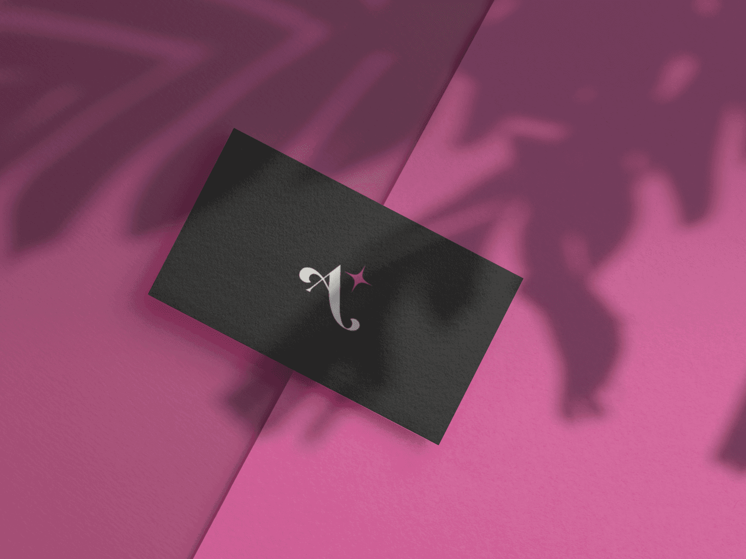
The final logo uses a custom typeface with flourished letterforms for elegance, complemented by the Barbie Pink starburst to add a playful yet refined touch.
The typography for Assasthetics was carefully selected to enhance the brand's luxurious yet modern aesthetic, ensuring it aligns with its identity as a beauty enhancement platform.
The completed Assasthetics brand identity successfully reflects the platform’s mission and values. The design communicates confidence, beauty, and individuality, resonating with its audience. The vibrant and cohesive branding ensures Assasthetics stands out in the competitive beauty market.
Outcome and Impact
2. Logo Elements
Custom Letterforms: The typography includes exaggerated flourishes on specific letters (e.g., “A” and “t”), adding a luxurious feel while maintaining readability.
Starburst Accent: Positioned to the top right of the logo, the Barbie Pink starburst symbolizes beauty, confidence, and uniqueness.
Color Application: The use of Shadowed Charcoal for the logotype grounds the design, while the Barbie Pink starburst draws attention, creating a perfect contrast.


The combination of Astila’s striking character and a minimal supporting typeface creates a harmonious typographic hierarchy. This pairing is versatile, making it suitable for diverse brand applications, including digital platforms, product packaging, and marketing materials, while consistently evoking sophistication and confidence.

ART DIRECTION
BRAND IDENTITY
ILLUSTRATION
GRAPHIC DESIGN
Assasthetics.
Assasthetics.

Introduction
Assasthetics is a beauty enhancement platform offering a curated selection of products and services aimed at elevating natural beauty while promoting confidence and self-expression. The goal of this project was to create a brand identity that captures the essence of Assasthetics, balancing elegance, glamour, and modern minimalism to resonate with its target audience.
Design Brief
The Assasthetics brand needed a sophisticated identity that reflects its mission of enhancing natural beauty. Key objectives included:
Designing a logo that represents the brand’s elegance and modernity.
Selecting a color palette that exudes confidence, style, and femininity.
Choosing typography that aligns with the brand’s tone of sophistication and empowerment.
Creating a brand identity that is cohesive across all touchpoints, from digital platforms to product packaging.
Design Process
1. Concept Development
The logo design process began by exploring visual elements that embody beauty, confidence, and self-expression. The goal was to create a logo that is both visually striking and timeless. The design integrates:
A graceful and bold typeface to reflect sophistication.
A sparkling pink icon as a representation of glamour and individuality.
2. Logo Elements
Custom Letterforms: The typography includes exaggerated flourishes on specific letters (e.g., “A” and “t”), adding a luxurious feel while maintaining readability.
Starburst Accent: Positioned to the top right of the logo, the Barbie Pink starburst symbolizes beauty, confidence, and uniqueness.
Color Application: The use of Shadowed Charcoal for the logotype grounds the design, while the Barbie Pink starburst draws attention, creating a perfect contrast.
3. Iteration and Refinement
Initial sketches explored various typographic styles and icon placements.
Digital drafts were refined to achieve balance and harmony between the logotype and the starburst icon.
The final logo uses a custom typeface with flourished letterforms for elegance, complemented by the Barbie Pink starburst to add a playful yet refined touch.
4. Final Logo Design
The final logo embodies modern beauty with a sleek typographic style and a bright accent, making it memorable and versatile across different applications.
Brand Colours
The Assasthetics color palette was carefully selected to evoke feelings of confidence, sophistication, and femininity:
Shadowed Charcoal (#1B1A1B): A deep, grounding hue that conveys elegance and authority.
White (#FFFFFF): A clean, minimal backdrop that highlights the brand’s simplicity and versatility.
Barbie Pink (#FF3C9E): A bold and vibrant accent that exudes femininity, playfulness, and confidence.
Typography
The typography for Assasthetics was carefully selected to enhance the brand's luxurious yet modern aesthetic, ensuring it aligns with its identity as a beauty enhancement platform.
The combination of Astila’s striking character and a minimal supporting typeface creates a harmonious typographic hierarchy. This pairing is versatile, making it suitable for diverse brand applications, including digital platforms, product packaging, and marketing materials, while consistently evoking sophistication and confidence.
Outcome and Impact
The completed Assasthetics brand identity successfully reflects the platform’s mission and values. The design communicates confidence, beauty, and individuality, resonating with its audience. The vibrant and cohesive branding ensures Assasthetics stands out in the competitive beauty market.
Reflection
The Assasthetics brand identity project emphasized the importance of creating a visual language that aligns with the brand’s mission and audience. Future iterations could include expanding the identity system to encompass additional elements like motion graphics and retail experience design.
Credit
Tools
Illustrator
Photoshop
Collaborators
Creative Direction: Fatunji Raymond
Design: Fatunji Raymond
Assasthetics.
Assasthetics.
ART DIRECTION
BRAND IDENTITY
ILLUSTRATIONS
GRAPHIC DESIGN
Introduction
Assasthetics is a beauty enhancement platform offering a curated selection of products and services aimed at elevating natural beauty while promoting confidence and self-expression. The goal of this project was to create a brand identity that captures the essence of Assasthetics, balancing elegance, glamour, and modern minimalism to resonate with its target audience.
Design Brief
The Assasthetics brand needed a sophisticated identity that reflects its mission of enhancing natural beauty. Key objectives included:
Designing a logo that represents the brand’s elegance and modernity.
Selecting a color palette that exudes confidence, style, and femininity.
Choosing typography that aligns with the brand’s tone of sophistication and empowerment.
Creating a brand identity that is cohesive across all touchpoints, from digital platforms to product packaging.
Design Process
1. Concept Development
The logo design process began by exploring visual elements that embody beauty, confidence, and self-expression. The goal was to create a logo that is both visually striking and timeless. The design integrates:
A graceful and bold typeface to reflect sophistication.
A sparkling pink icon as a representation of glamour and individuality.
2. Logo Elements
Custom Letterforms: The typography includes exaggerated flourishes on specific letters (e.g., “A” and “t”), adding a luxurious feel while maintaining readability.
Starburst Accent: Positioned to the top right of the logo, the Barbie Pink starburst symbolizes beauty, confidence, and uniqueness.
Color Application: The use of Shadowed Charcoal for the logotype grounds the design, while the Barbie Pink starburst draws attention, creating a perfect contrast.
3. Iteration and Refinement
Initial sketches explored various typographic styles and icon placements.
Digital drafts were refined to achieve balance and harmony between the logotype and the starburst icon.
The final logo uses a custom typeface with flourished letterforms for elegance, complemented by the Barbie Pink starburst to add a playful yet refined touch.
4. Final Logo Design
The final logo embodies modern beauty with a sleek typographic style and a bright accent, making it memorable and versatile across different applications.
Brand Colours
The Assasthetics color palette was carefully selected to evoke feelings of confidence, sophistication, and femininity:
Shadowed Charcoal (#1B1A1B): A deep, grounding hue that conveys elegance and authority.
White (#FFFFFF): A clean, minimal backdrop that highlights the brand’s simplicity and versatility.
Barbie Pink (#FF3C9E): A bold and vibrant accent that exudes femininity, playfulness, and confidence.
Typography
The typography for Assasthetics was carefully selected to enhance the brand's luxurious yet modern aesthetic, ensuring it aligns with its identity as a beauty enhancement platform.
The combination of Astila’s striking character and a minimal supporting typeface creates a harmonious typographic hierarchy. This pairing is versatile, making it suitable for diverse brand applications, including digital platforms, product packaging, and marketing materials, while consistently evoking sophistication and confidence.
Outcome and Impact
The completed Assasthetics brand identity successfully reflects the platform’s mission and values. The design communicates confidence, beauty, and individuality, resonating with its audience. The vibrant and cohesive branding ensures Assasthetics stands out in the competitive beauty market.
Reflection
The Assasthetics brand identity project emphasized the importance of creating a visual language that aligns with the brand’s mission and audience. Future iterations could include expanding the identity system to encompass additional elements like motion graphics and retail experience design.
Credit
Tools
Illustrator
Photoshop
Collaborators
Creative Direction: Fatunji Raymond
Design: Fatunji Raymond
GET IN Touch
GET IN Touch
From concept to creation
Let’s make it happen
Send me an email and I’ll get back to you asap.

GET IN
Touch
GET IN
Touch
From concept to creation
Let’s make it happen
Send me an email and I’ll get back to you asap.
GET IN
Touch
GET IN
Touch
From concept to creation
Let’s make it happen
Send me an email and I’ll get back to you asap.
Inspired by Art, Fueled by Amala 🤤. © 2024
Inspired by Art, Fueled by Amala 🤤. © 2024